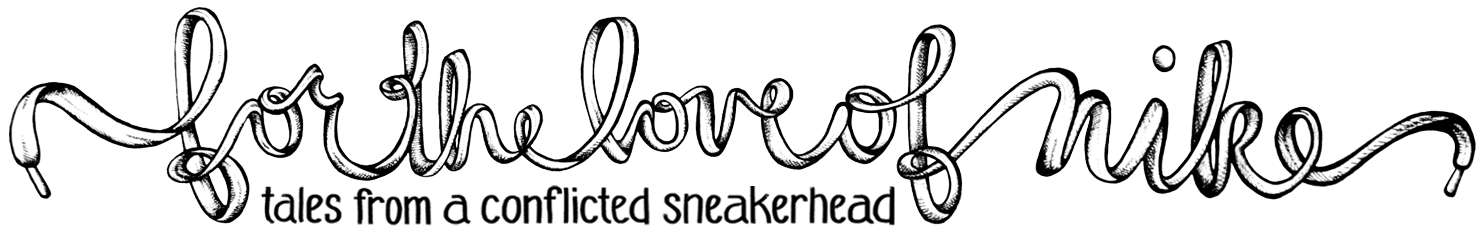
Every year Pantone picks a color that encapsulates what’s going on in our culture at the moment. Don’t you love the idea of of condensing modern time and mood into a hue? For 2016, Pantone identified 2 colors that represented the our current state: Rose Quartz and Serenity.
“Rose Quartz is a persuasive yet gentle tone that conveys compassion and a sense of composure. Serenity is weightless and airy, like the expanse of the blue sky above us, bringing feelings of respite and relaxation even in turbulent times.” -Patone

Now that we’re half way through the year, what are your thoughts on the Pantone pick? Inner balance and mindfulness played a big role in 2016’s color, along with a nod towards gender neutrality. You can read more about the reasoning behind the decision here.
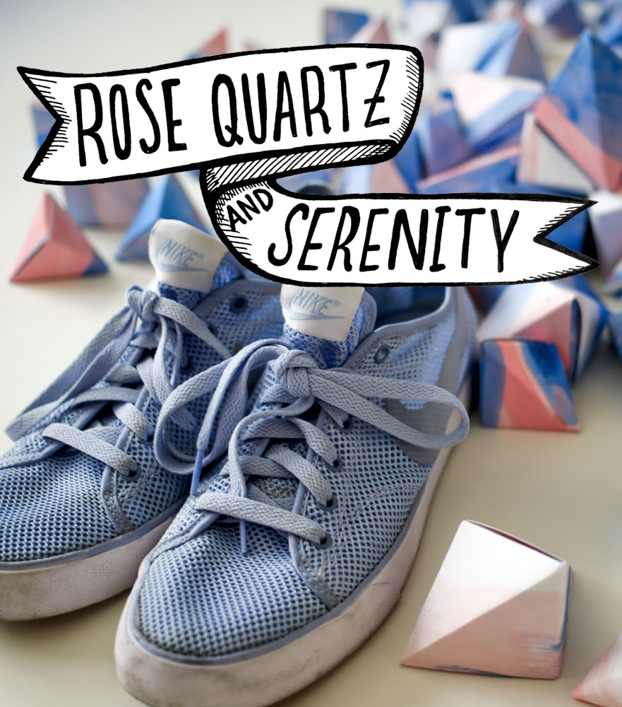
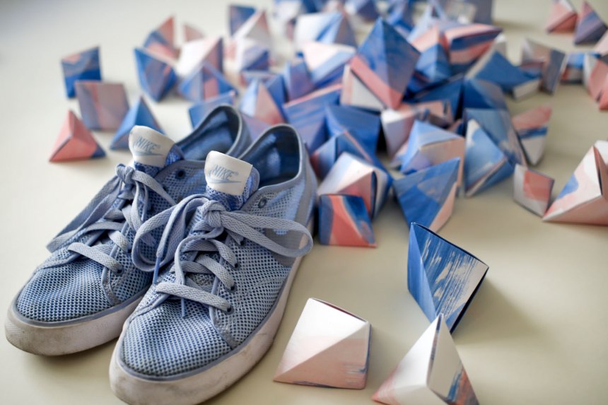
I really dig the combo. So I made a few hundred origami as an homage.
Like it? You can snag them for yourself here. Or are you looking for a matte approach? Got you covered here.


Head on over to my etsy page if you want to see more!


I like it! 🙂
thanks for sharing!!!!